Spider-Man 2 was filmed in 2004, the American superhero film was directed by Sam Raimi and written by Alvin Sargent. This sequel started in 2002 from the film ‘Spider-Man’. Spider-Man 2 was released in IMAX theatres on June 30. It won the award of the Academy Award for Best Visual Effects and was also nominated for Best Sound Mixing/Editing. The film is often stated as one of the best superhero film of all-time, which successfully led to the release of Spider-Man 3 in 2007.
In my opinion, this is a true classic super-hero film. I grew up watching this film so I expect positive things for the film review below.
Magazine Film Review:

Layout:
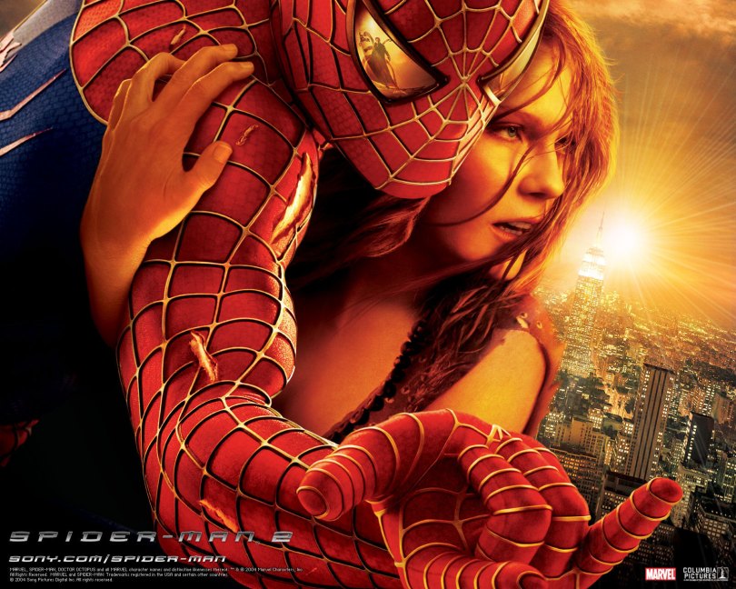
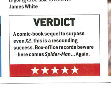
Evidently, the image presented to us is bold and bright which dominates 3/4 of the first page and the second whole page. The image ratio from the text is similar, ultimately one page being text based with 6 paragraphs and the other page with a big centred image. Coupled with this, a small caption is inserted for the description of the image, this is located under the ‘Film of the month’. This then brings attention to the PG sign which creates a wider bracket range from children to adults. News Films icon is at the header within the article to distinguish that it is a review. This is kept in the theme and layout of a typical magazine film review which familiarizes the audience to what they are reading. The subheading gives a overall summary of the film to guide the audience at the start of the review. By including this at the start makes the readers face a decision if the plot would be engaging and enjoyable to watch. By doing this it prepares fans for something epic to occur in the review. The bold title ‘Spider-Man 2’ is positioned at the top of the article in the top left hand corner. This is easily distinguishable to what the film is that’s being reviewed. The review consists of a tagline which is typically displayed under the title of the film review which is almost a vague advertising/persuading purpose. At the end of the review a box labelled ‘Verdict’ is given where a star rating is given. This film had been given 5/5 stars. By having this audience are even more intrigued to watch the film after been giving this information at the end of the article.
Typography/Language:
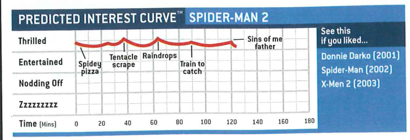
The title is a Sans Serif font which is simple but bold to identify the film. This appears more animated and fitting for the genre type. ‘PG’ is levelled with the title but has a smaller font size, which distinguishes the wide range of people. ‘W’ has a bigger font than the rest of the article font size, this is typical in articles, where the first letter would have a greater font size to where the article begins. Another heading is used to separate the last two paragraphs, this makes it more engaging to read. The text written says: ‘Drop jaws and staple them’ the hyperbole used is typical to persuade the audience to watch the film and make them feel intrigued. The ‘Film of the month’ overlays the picture with blue and white. This surprises readers, and entices them to want to see this to make their own judgment of the film. The language in this review is quiet informal. It is obvious the review is for Spider-Man fans as the publisher gives exactly what fans want to hear. This is clear with insights into the spoilers of the film e.g. the background of Mary Jane in the film. By including her it shows these actors will continue into the second film which helps connect with fans. The subheading: ‘What’s the story?’ is exactly what the audience want to know, the rhetorical questions makes the audience wonder and want to find out what the story really is. The use of direct address becomes personal between the readers, and is a good persuasive device to sell the film and the plot. The tagline ‘The amazing Spidey swings to new heights in Sam Raimi’s jaw-crashing sequel…’ includes ellipses to further intensify the suspense and excitement. Another image is positioned at the end of the article labelled: ‘Predicted Interest Curve’, this is creative and unique in this review, and I thought was very effective, this makes me feel promised that the film will be thrilling and entertaining.
Images:
The visual message is just as important than the written text which could reflect the target audience. Spider- Man’s body language in this conveys more action yet to come, the fact he is in his ‘costume’ again shows more antics that Peter Parker faces. Another image is positioned at the end of the article labelled: ‘Predicted Interest Curve’, this is creative and unique in this review, and I thought was very effective, this makes me feel promised that the film will be thrilling and entertaining.
Colour:
The colours in this review consist of red, blues, blacks and whites, this is to resemble the Spider-Man costume, which makes the review look professional and symmetrical in colours. The colours are bright and colourful to engage with the target audience. To conclude, the review is very positive; with the authors name stated at the end of the article ‘James White’.